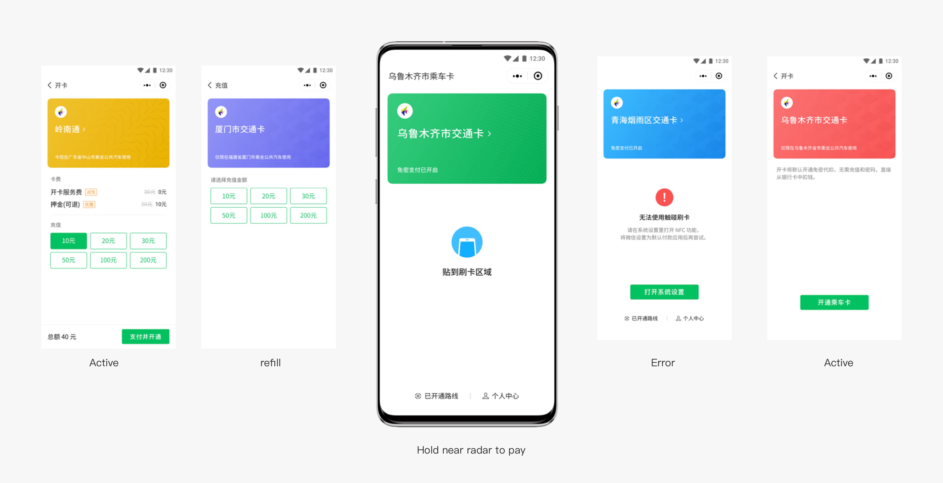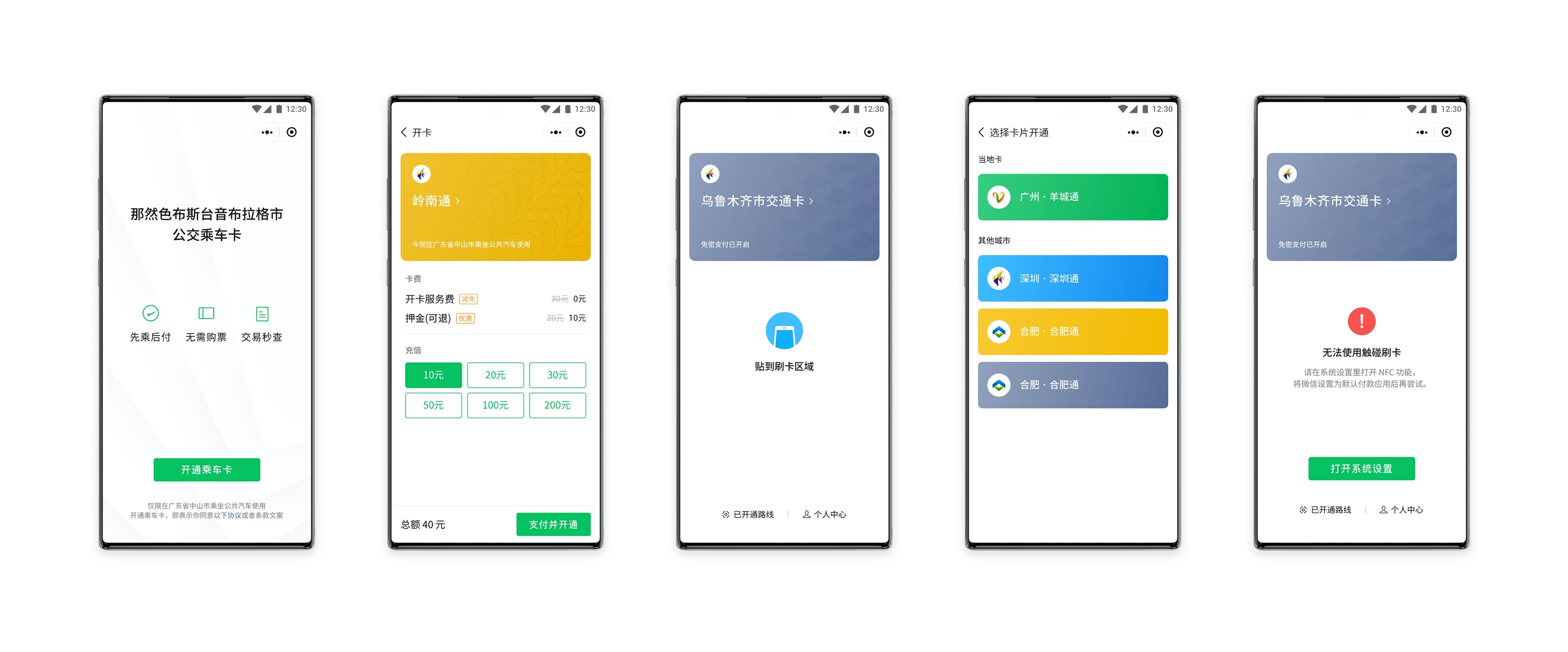
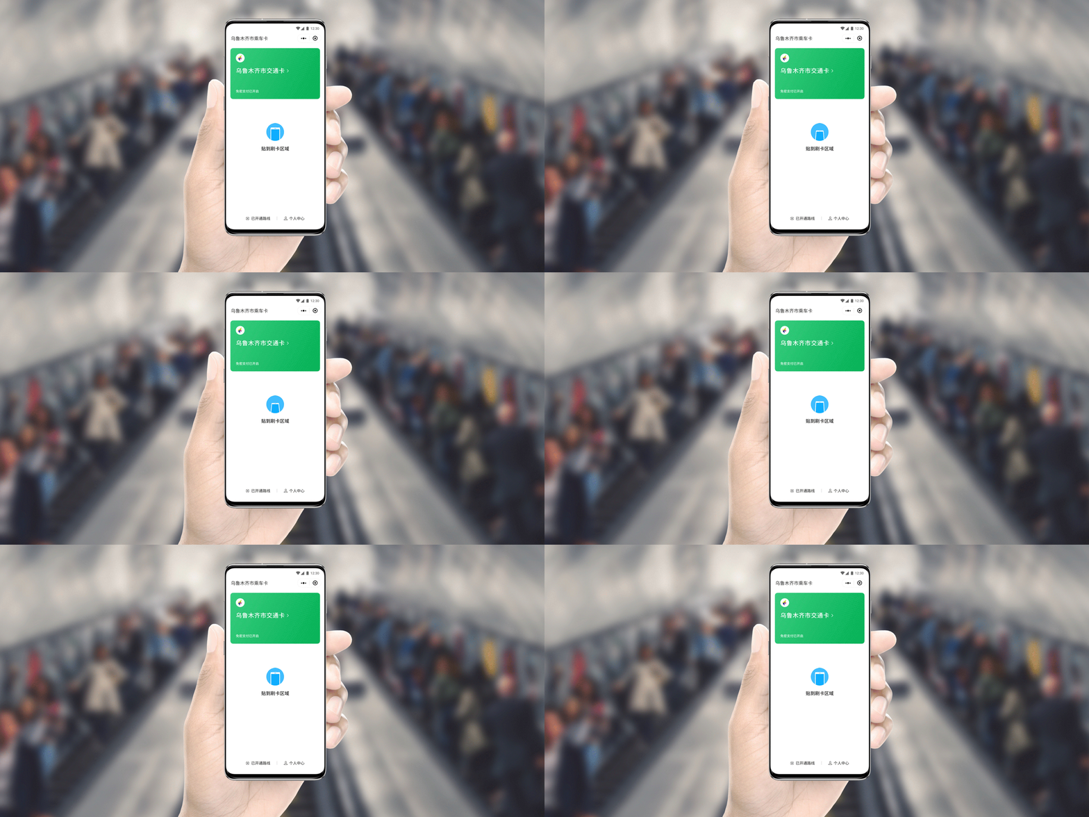
Background
The mobile payment is blooming in China. WeChat virtual transportation card is one of the projects I did when I do an internship in WeChat. This is an efficient and low-cost solution for some medium and long tail cities to have mobile payment in their transportation system.
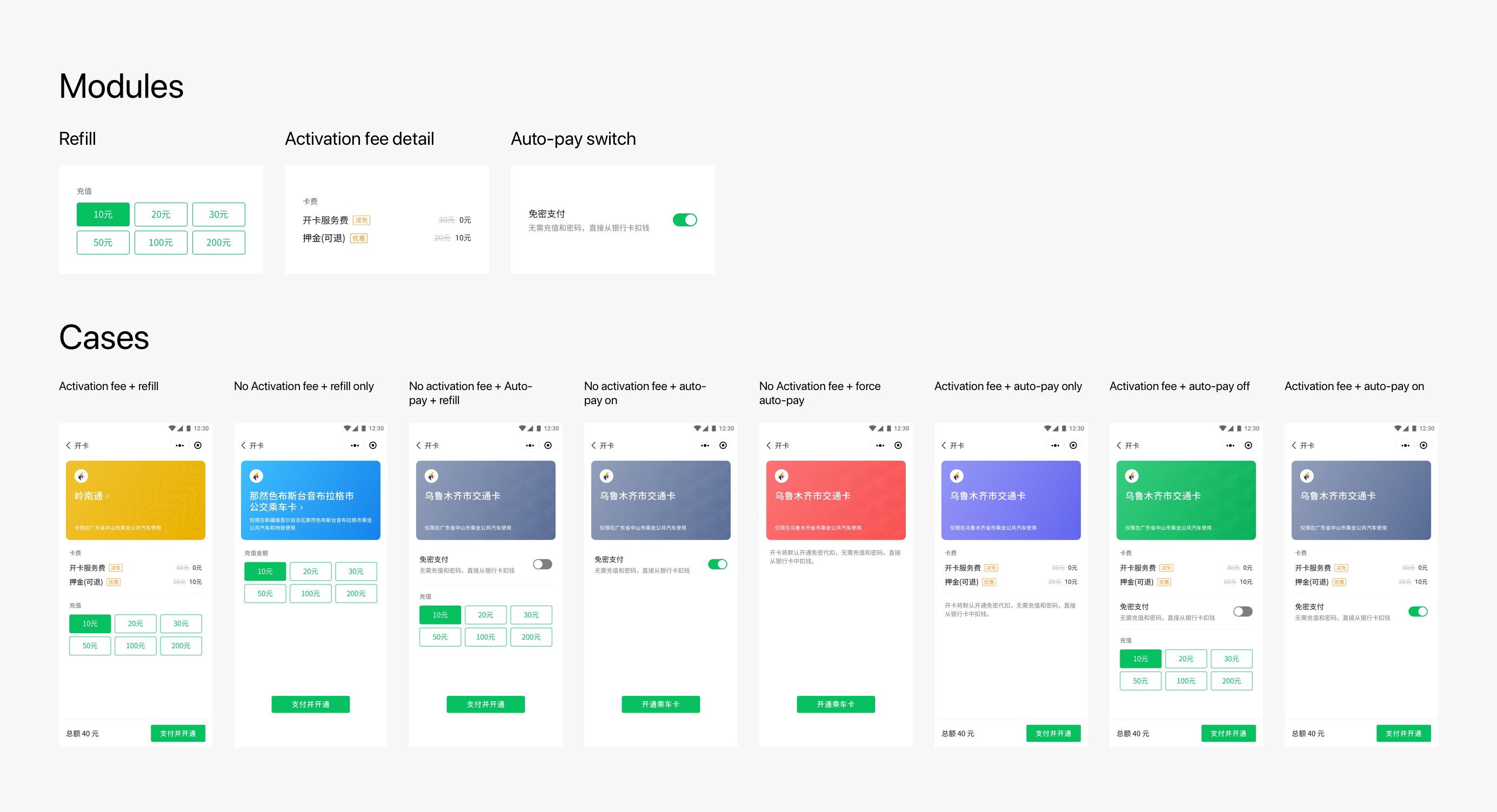
An modular interface deal with all customization options
As a solution for many different cities, we provide many customize settings. For example, card fee and recharge: The provider can set discounts, different recharge level or let the user connect to a credit/debit card.
A good way to adapt every situation is a modular interface:
Design the card without hiring designer
I have investigated the appearance of the current Chinese city ride card, and the situation is not satisfactory. They are not only poorly readable, and they are not able to satisfy our diverse information.
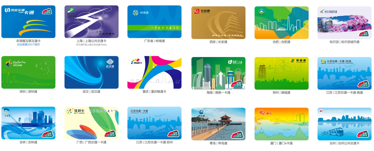
City transit cards in China
But considering that our target users are medium and long-tail cities, their design costs will be lower, and the results maybe even worse. So, we need a systematic, readable card look.
Our solution is coming up with a rule. Card provider can generate a look by choosing a color and a texture from all the options. The texture represents various keywords related to traffic, and the colors are from the WeChat color palette.
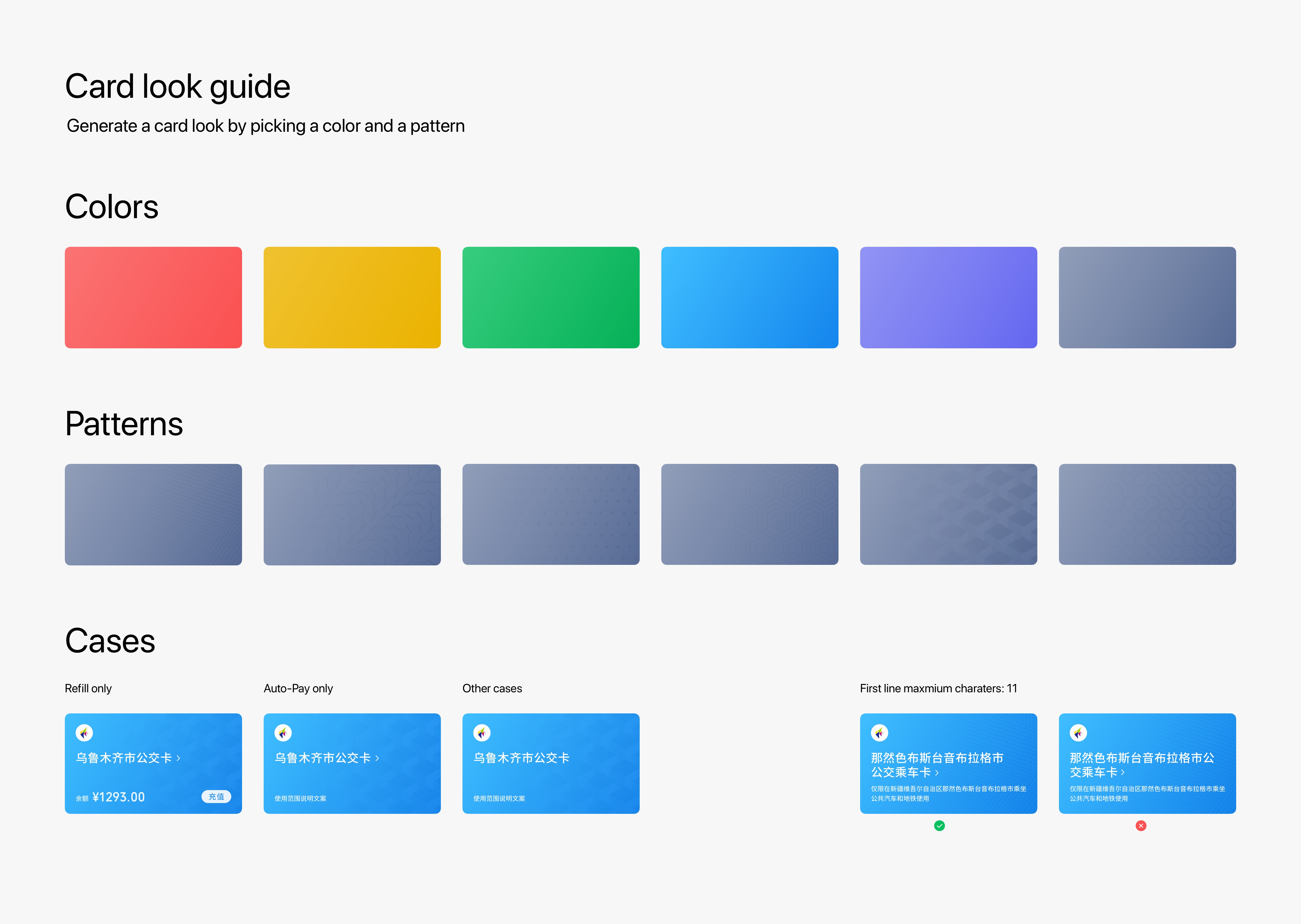
Card look guide
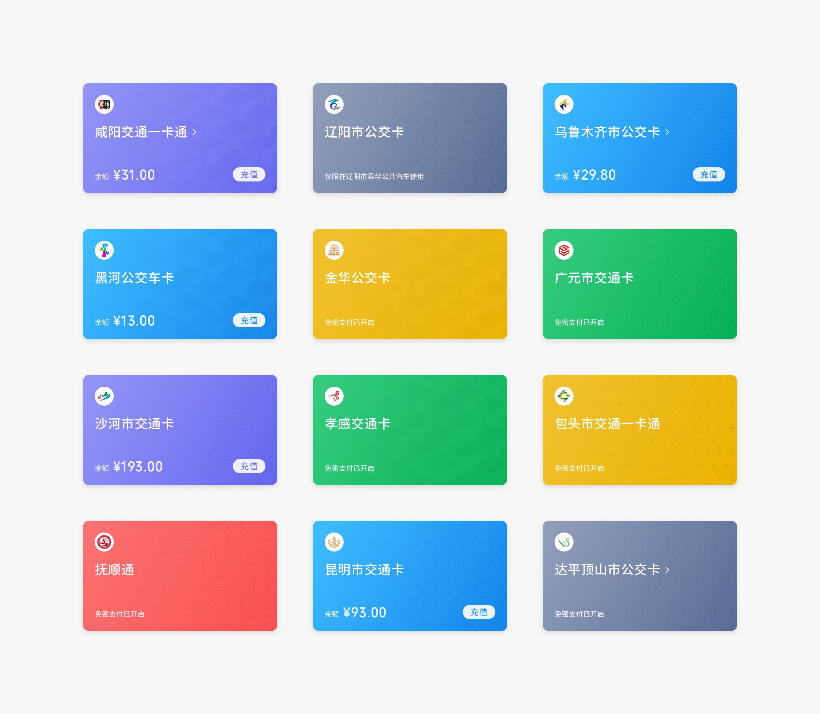
Cards look example
Talk to the card, not the app.
As much content as possible is centered around the card and talks in the form of a card. I want users to think that what they are working on is the card itself, not an app.
