
ICON DESIGN
MAY 2017
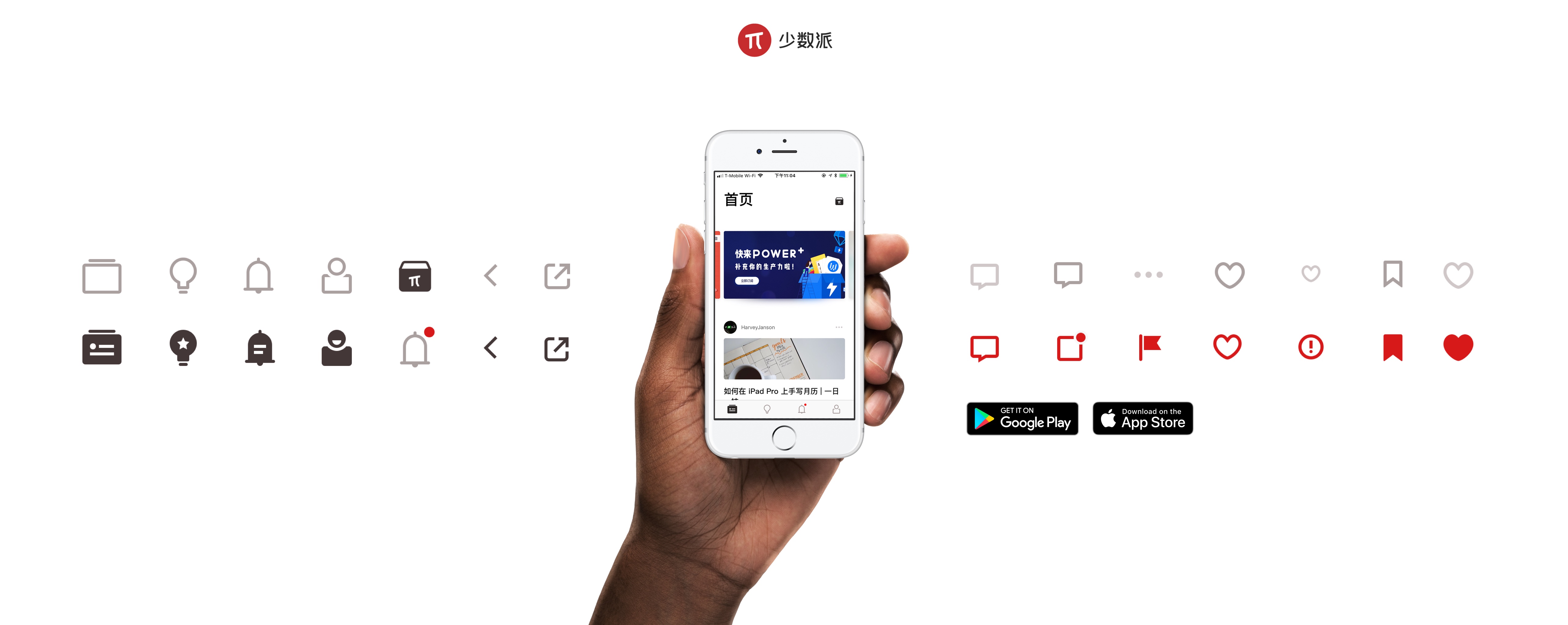
SSPAI now is available at App Store and Google Play.
In May 2017, Sspai, a famous Chinese UGC technology, and lifestyle media are going to launch its iOS app. But They are not satisfied with the icons inside the app. I redesigned the whole icon set.
Our goals are:
· Simplify the shape.
· Looks different from other apps.
· Have one or two special icon as leader.
· Icon works without text.
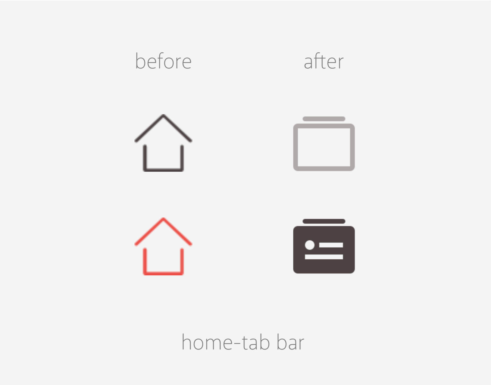
Instead of using the house icon as “home,” “cards“ icon is better for SSPAI app. Because the home page of this app is a news feed and looks like cards.
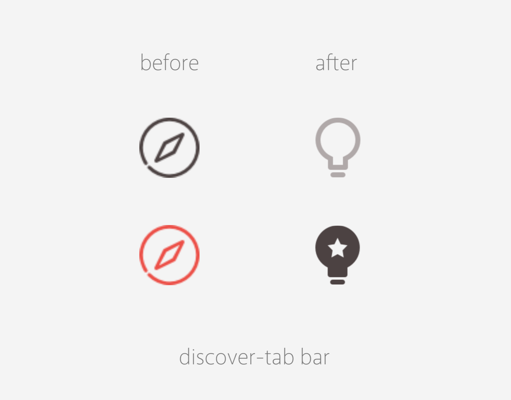
A light bulb is more lively as “discover.” Also, the star only appears when you at discover section. This small detail makes users feel happy.
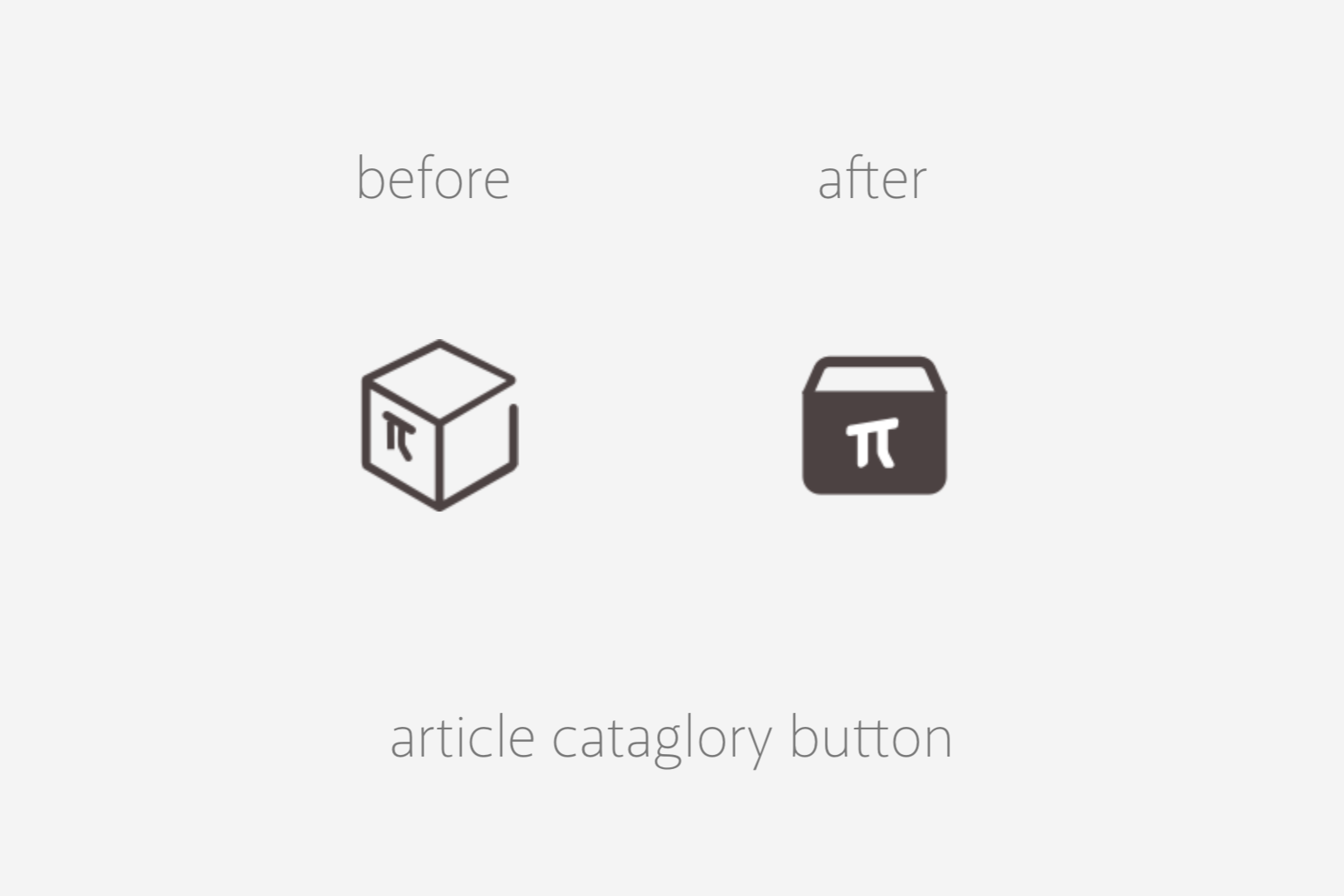
Some icons in the previous version have three-dimension view which is not fit as an icon set. I fixed it as a flat icon but still indicates the same thing.
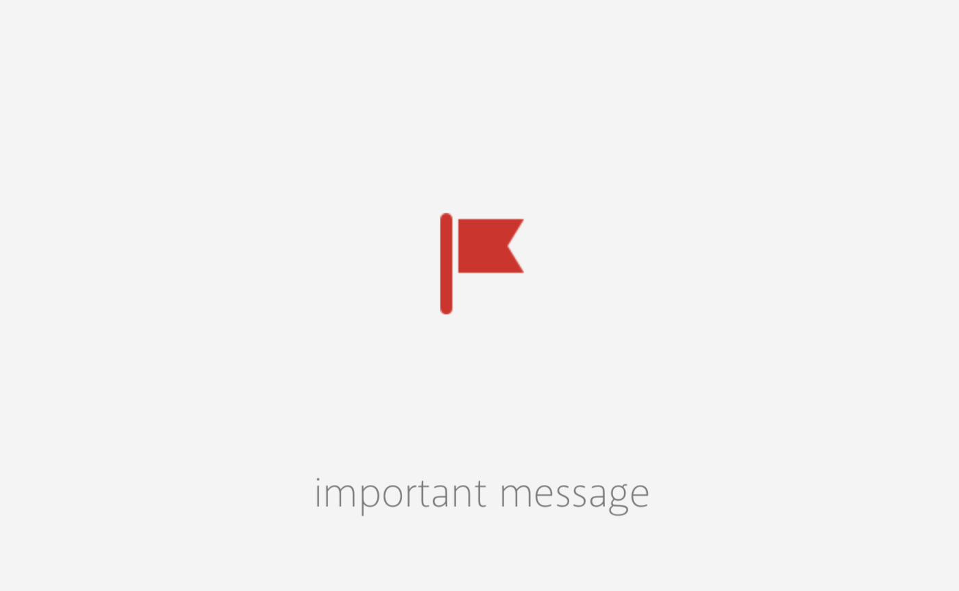
Because SSPAI is user-generated content based, an icon for the important message was added to the new icon set. It’s when your article gets approved or recommend to the home page; this flag icon will appear in the notification section. The flag gives a feeling of achieving.
Here is the process of icon style iterating:
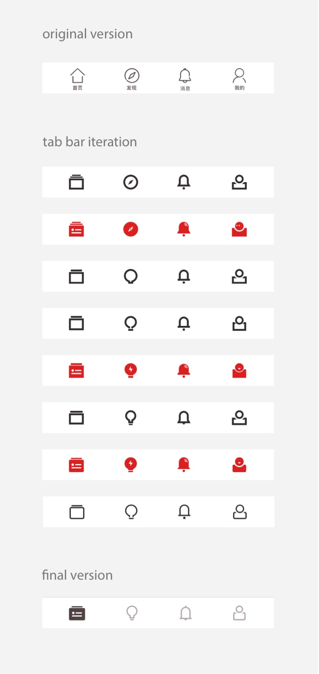
The process of icon style iterating
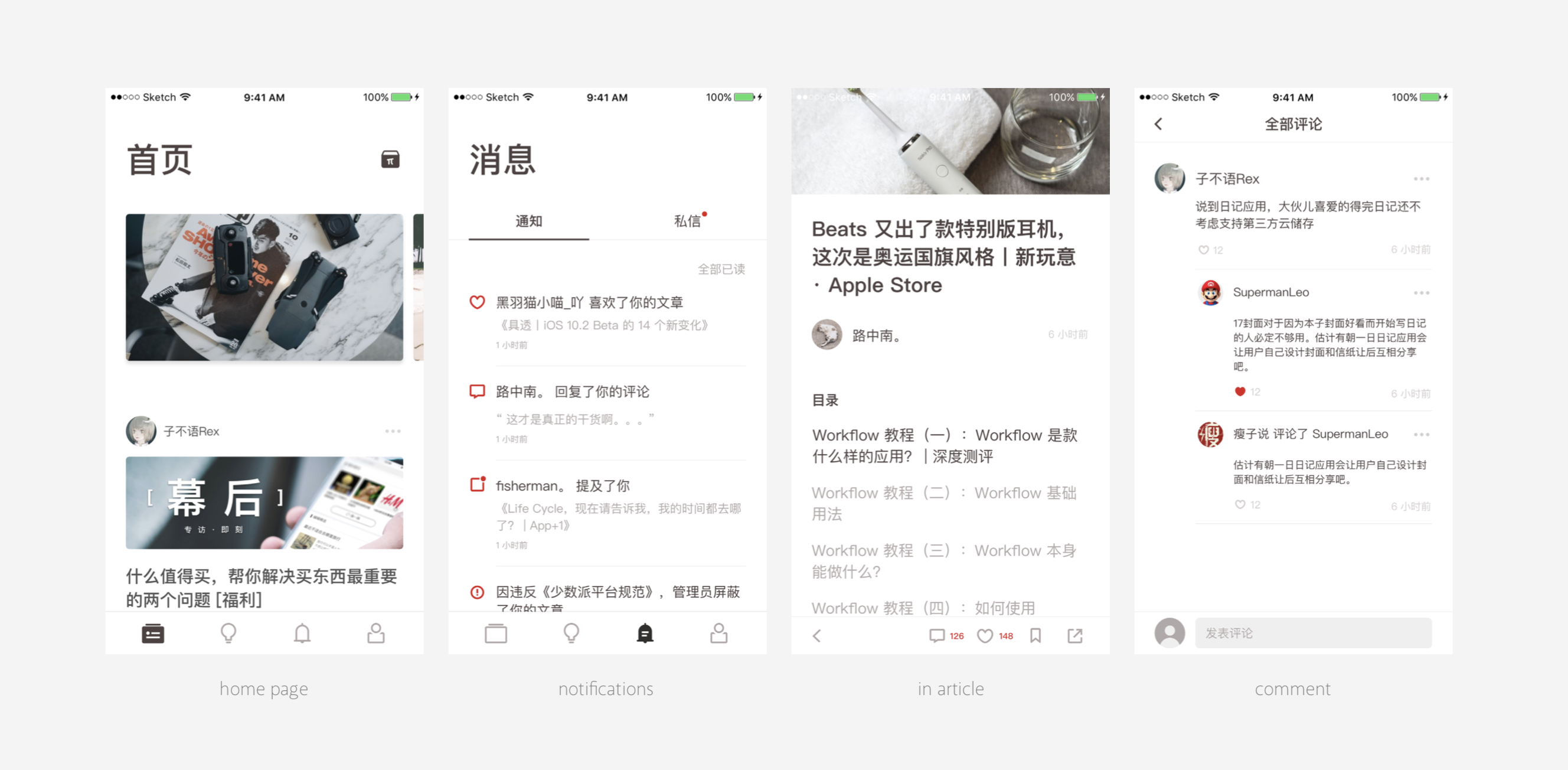
Icon in use
From here, SSPAI has their icon set and the basic icon style. This icon set is carried out for the iOS and Android app. In the near future, it will expand and appear on SSPAI.com since I'm working on it.